Well, I had a demo of Facebook, and it’s a very nice web application. [Previously: Attention Metastream. Today: Fred Wilson on the changes (good comments thread).]

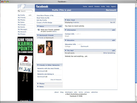
(I have removed names from this screenshot.)
It’s hard to get a sense of it from the picture, but I can tell that if I were a college student it would be easy to live here and check in frequently and see what my friends are up to and post about my life. There are nine million Facebook users, so they’re doing something right.
I also note there is zero “flashy design” on this site. Note the one-color plus black palette, the simple obvious layout, the single ad in the left column, the simple unobtrusive logo in the upper left. It’s a beautiful minimalist approach. This has the beneficial side-effect of lowering the server load and bandwidth costs for high-traffic sites.
It seems like the most popular websites either have bad design, or minimal design. You might want to think about that the next time you spend two hours getting the rounded corners just so in your incremental design update. Better to hire a good writer, or to think about your use-cases and user-centric design. As always, design has to support the message and function, not overtake the purpose of the effort. Facebook is a good example of What People Want.
September 7, 2006